An Interactive Map of Community Susceptibility
Summary
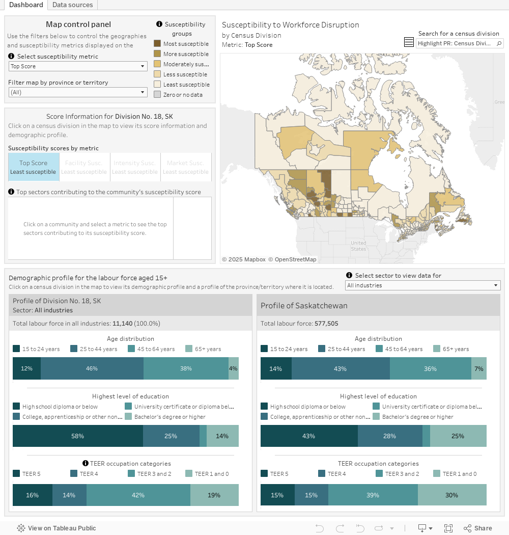
This interactive map uses three metrics to assess the level of local susceptibility to the policy, technology and market changes that are likely to take place over the coming decades as Canada and the world reduce greenhouse-gas emissions.
By default, the map shows a fourth view, called “Top Score”, in which we summarize the results by assigning each community the highest score across all three metrics. To learn more about a community, click on it or search for it in the top right corner. After that, you can cycle through the metrics to see the top sources of susceptibility. Below the map, you’ll find additional demographic data of the selected community and the corresponding province or territory. If the tool is loading slowly, you can filter the view by province or territory to improve performance.
Additional resources, including the methodology, data downloads, and a user guide are at the bottom of this page.
NOTE: The map is best viewed on a desktop computer. Additional whitespace will display if viewed on mobile.
Resources
- See a snapshot of the analysis on one page.

- Learn more about the development of the map, including data sources and analysis related to each of the metrics.

- This guide provides an overview of the map’s components, including how to search for specific census divisions and how to navigate the mapping tool and information panels.

Data
- Overview of Canadian census divisions and their scores
- Download this file to reference the scores and additional information for all 293 communities on the map
- Community Susceptibility Scores
- Download the final community susceptibility scores for further analysis
- Visit our data page to explore the sources used to create this tool. The IRPP can provide more detailed underlying data upon request to researchers interested in extending the analysis.
Contact us
- Email our team with comments, questions, and feedback at communitytransformations@nullirpp.org
